
How to Choose a Home Colour Scheme (SG Guide)
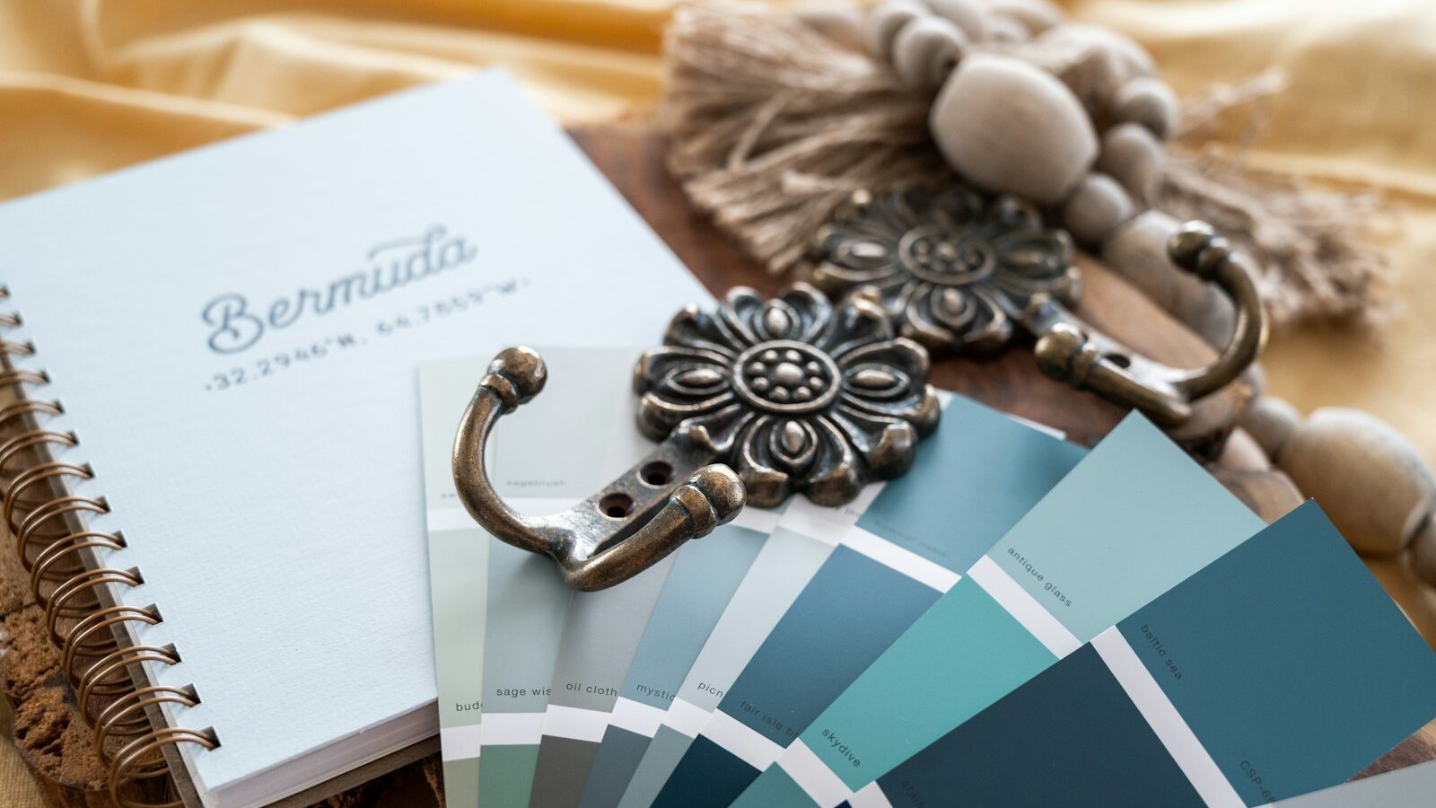
Wondering how to choose a colour scheme for your home? The short answer: pick one main neutral for about 60 percent of the room, a secondary tone for 30 percent, and a single accent for the final 10 percent — then test every shade against your home’s actual daylight before committing. This guide walks Singapore homeowners through that method, with palettes that flatter our bright, warm light.
The quick method: how to choose a colour scheme in 5 steps
- Start with a fixed element. Choose colours around something you cannot easily change — your flooring, a feature stone, the sofa, or a piece of art. This anchors everything else.
- Pick your 60 percent base. This is usually a wall and large-surface neutral: warm white, soft greige, or pale oat. It sets the mood of the whole space.
- Add a 30 percent secondary. A supporting tone for cabinetry, curtains, or a feature wall — think muted clay, sage, deep navy, or a warmer wood.
- Choose one 10 percent accent. A bolder colour for cushions, lighting, or styling. This is where personality lives.
- Test in your real light. Paint A3-size swatches, tape them up, and check morning, afternoon and evening before buying tins.
What is the 60-30-10 rule?
The 60-30-10 rule is a designer shorthand for balance. Roughly 60 percent of a room is your dominant neutral, 30 percent is a secondary supporting colour, and 10 percent is an accent. It stops a scheme from feeling either flat or chaotic. You do not need to measure precisely — it is a guide for proportion, not a formula. We use it on most projects, from a compact HDB flat to a larger condo.
Choosing colours for Singapore’s light
Singapore daylight is strong, warm and fairly consistent year-round, which changes how paint reads. North-facing rooms get cooler, steadier light; west-facing rooms get intense warm afternoon sun that can make beiges look orange and greys look muddy.
- Bright, sun-facing rooms: cooler neutrals and soft greys hold up better and feel calmer.
- Interior or shaded rooms: warm whites and creams stop the space looking grey and lifeless.
- Watch undertones: a “white” with a green or blue undertone can turn cold under LED lighting. Always check against your bulbs.
Colour scheme types to consider
| Scheme | How it works | Best for |
|---|---|---|
| Monochromatic | One colour in several shades | Calm, cohesive bedrooms |
| Neutral + accent | Neutral base, one bold accent | Most Singapore living rooms |
| Analogous | Colours next to each other on the wheel | Soft, harmonious spaces |
| Complementary | Opposite colours, used sparingly | Energetic, characterful rooms |
Flow between rooms
In an open-plan flat or condo, colours should relate rather than match. Carry your base neutral throughout, then shift the secondary and accent by room. This keeps a sense of continuity, which matters when you can see three spaces at once — a common situation we plan for in space planning. If you are opening up walls, our guide on designing an open-concept home pairs well with this one.
Common colour mistakes
- Choosing paint from a tiny chip or a phone screen instead of a large swatch in situ.
- Using too many competing accents — one or two is plenty.
- Ignoring fixed finishes like floor tone or marble veining, then fighting them later.
- Picking pure brilliant white everywhere, which can feel clinical under cool LEDs.
If your space is small, a tighter, lighter palette helps it breathe — see our notes on the best paint colours for small rooms.
FAQ
How many colours should a home have?
As a rule, three to five across the whole home works well: one base neutral, one or two secondary tones, and one or two accents. Repeating them in different proportions keeps things cohesive without feeling repetitive.
Should every room be the same colour?
No. A shared base neutral gives flow, but each room can have its own secondary and accent. Bedrooms can go quieter and moodier; living and dining can be brighter and more sociable.
What colours make a Singapore home feel bigger?
Light, warm neutrals with low contrast between walls, ceiling and trim make a room feel more open. Keeping skirting and ceilings close to the wall tone blurs the edges and lifts the sense of height.
Is it safe to use dark colours in a flat?
Yes, used thoughtfully. A dark feature wall or dark cabinetry can add depth and cosiness, especially in a bedroom. Balance it with lighter surrounding surfaces and good layered lighting so the room never feels heavy.
Do I have to follow trends?
Not at all. Choose a palette you will still like in five years and treat trends as accents you can swap. Timeless neutrals age far better than a fully on-trend room.
Want a palette tailored to your home’s light, layout and lifestyle? Our designers can build one as part of a full-home design. Book a consultation with Elements and we will help you choose a colour scheme with confidence.